
D
Deleted member 1
Guest
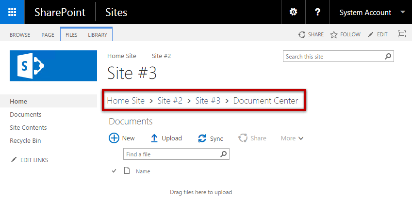
So an expanded breadcrumb?I believe he's asking for breadcrumbs how SharePoint uses them. I could be wrong. I can get you a screenshot and stuff after I drop mini me off at daycare.
Create a modern breadcrumb navigation on SharePoint - HANDS ON SharePoint
Breadcrumb navigation was available by default on SharePoint 2007 and 2010 but with the introduction of SharePoint 2013 it was removed and until today it wasn’t reintroduced. Today I’m revisiting one my most read articles, back in 2013 I wrote an article to explain how this functionality can be...sharepoint.handsontek.net
Oooooo, I like how the new software handles URL's. Fancy Smancy.
What's the desired behavior? The breadcrumb contracts now due to modern mobile formatting for more consistent behavior between devices.
If you are in a thread the breadcrumb will jump you back to that subforum.
What's the goal?
To jump back to the forum overview from the thread?
That's what I mean by desired workflow. Not desired layout but let's talk about the workflow that you're trying to do and find the best layout that's consistent with modern web design.
I will be making the top logo go to the forum overview instead of the main page. That solves the rapid single click move around the forums.
If there is some other desired workflow needed let me know.


